Anchorhead Coffee

Project overview
The product
Anchorhead Coffee is a specialty coffee roaster based in Duvall Washington. It has cafes in Downtown Seattle, Issaquah, and Bellevue. They offer a wide spectrum of competitive pricing. Anchorhead targets customers are commuters and workers who like enjoying coffee during the day.
My Role
UX designer designing an app for Anchorhead Coffee Shop from conception to delivery.
- Research
- Wireframe
- Prototype
Responsibilities
Conducting interviews, paper and digital wireframing, low and high-fidelity prototyping, conducting usability studies, accounting for accessibility, and iterating on designs.
The problem
There was no mobile app to make the product more accessible for users.
There was no convenient way to skip the line and order ahead.
The goal
My goal was to create an app, that enhance overall ordering experience for Anchorhead Coffee customers. Help users skip the line, make an order, locate the Anchorhead coffee shops in town and find all their information.
User research
Summary
I conducted interviews and created empathy maps to understand the users I’m designing for and their needs. A primary user group identified through research was adults who enjoying their coffee twice a week.
Research revealed some factors limiting users from ordering coffee :
there is no way to order coffee online using an app
lack of information about shop locations.
Pain points
Platforms for ordering food does not exist
There is no way to choose the location
Working adults are too busy to stay in the line.
Persona

User journey map
Mapping Maya’s user journey revealed how helpful it would be for users to have access to a dedicated Anchorhead Coffee app.

I conducted competitive audit with the main competitors.


Competitive audit goal:
To compare the user experience of each competitor’s web page and app.
To revealing the strengths and weaknesses for each application.
To find a way to attract users to the new app.
Starting the design
Paper wireframes
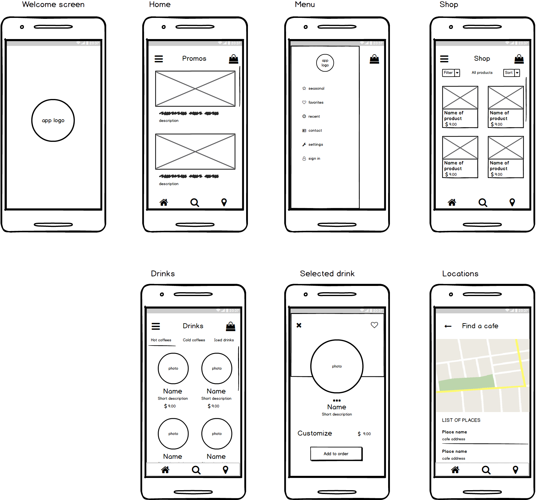
I created the basic wireframes for the main user scenarios. For this step I used the Balsamiq Wireframes tool.
Taking the time to draft iterations of each screen of the app ensured that the elements that made it to digital wireframes would be well-suited to address user pain points.
Digital wireframes and low-fidelity prototype
As the initial design phase continued, I made digital wireframes based on feedback and findings from the user research.

I’ve created a low-fidelity prototype using the set of digital wireframes
View the Anchorhead’ Coffee
Low-fidelity prototype

Usability study: findings
I conducted an usability study. The findings helped guide the designs from wireframes to mockups and revealed what aspects of the mockups needed refining.
Users need better cues for what steps are required to make an order.
Users need a more intuitive way to use customization menu.
Users need a more intuitive way to use the map and list of locations.
Based on users reviews and overall research I have made the following conclusions:
It is good idea to show all new promotions at the very first screen ( “home” ) . Colorful images can make that promos even more attractive. It can increase sales.
Adding “Favorites” and “Recent” categories to the menu allows users to find their desired items more quickly.
Too many icons with different sizes and colors on one screen can be distractive. It may cause navigation difficulties for users.
“Locations” is extremely helpful feature for these kind of applications.
It is convenient to use only a few main navigation buttons at the bottom, and have the rest categories hidden in hamburger menu.
Refining the design
Final Mockups


High-fidelity prototype
The final high-fidelity prototype presented cleaner user flows for choosing an item and checkout. It also meet user needs for a pickup option as well as more accurate customization. For creating the prototype I used Figma.
View the Anchorhead’ Coffee
High-fidelity prototype

Accessibility considerations:
Used icons and contrast colors to help make navigation easier.
Used detailed imagery for drinks and other items to help all users better understand the designs.
Takeaways
Impact
The app makes it possible to order and pickup coffee when and where it is convenient for user.
One quote from Anchorhead Coffee shop owner feedback: “This is supercool. We would like to use it for a mobile app”
What I learned
While designing the Anchorhead Coffee app, I learned that the first ideas for the app are only the beginning of the process. Usability studies and peer feedback influenced each iteration of the app’s designs.
Next steps
Conduct more user research to determine any new areas of need.
Collaborate with the owners of Anchorhead Coffee to make the product even better, and find possibility to publish it.
Let’s connect!
Thank you for your time reviewing my work on the Anchorhead Coffee Shop app! If you’d like to
get in touch, my contact information is provided below.
Email: oligachebot@gmail.com
LinkedIn: linkedin.com/in/olga-ce